Let’s paint with a minimalist watercolor palette
For several months, I’ve decided to work with a minimalist watercolor palette. When I first started painting, I had a wide range of different colors and was quite afraid to mix them. So, every time I wanted to try something new, I bought new colors. However, I felt the need to align my artistic practice with my way of life and how I perceive things in general. Simultaneously, I wanted to create coherence in the colors I used without restricting myself from exploring others.
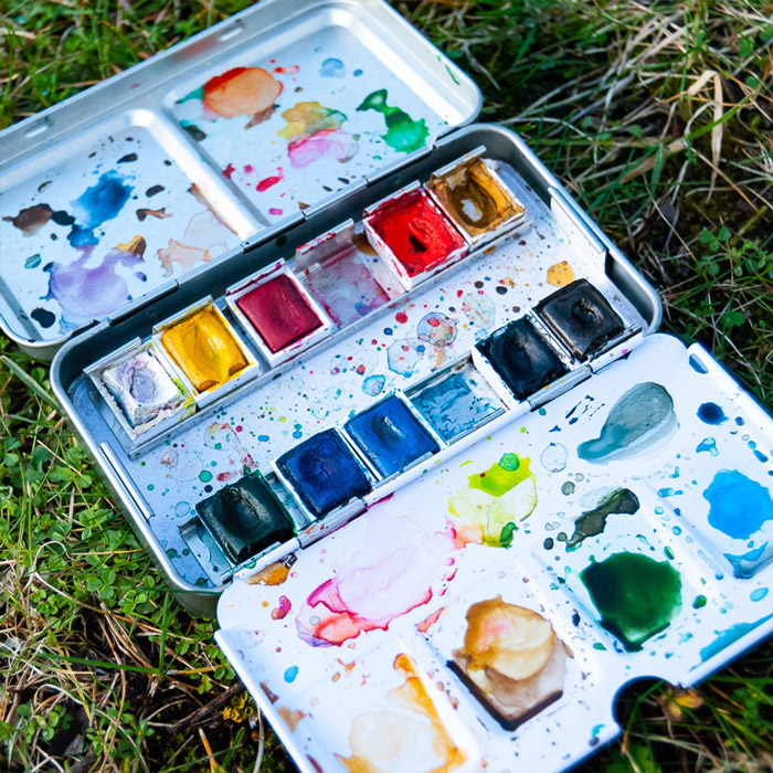
I initially had a Winsor & Newton box, but I recently switched to a smaller one that I found at a craft shop in Denmark called Panduro. It’s not perfect for mixing colors, so I use a palette made by my husband.
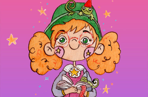
Here are the colors I use and mix in all my paintings:
✨ Chinese white: I like to use this one to create pastel colors.
✨ Cadmium yellow: I love how this color shines.
✨ Permanent rose: very luminous.
✨ Cadmium red deep hue: this color is very intense and feels like Christmas red to me.
✨ Yellow ochre: one of my favorites; I love to mix it with green and red to create a more natural color.
✨ Hooker’s green light: very intense, like a Christmas tree or a dark forest.
✨ Turquoise: a magical blue for me.
✨ Cerulean blue: very light, like a beautiful sky.
✨ Indigo: I love the intensity of this color. I like to use it instead of black for the hair.
✨ Sepia: I was searching for the perfect brown, and this one is the ideal match for me.
What colors do you have in your watercolor palette?


You May Also Like
Feeling a little nostalgic? Color the best consoles in the World
A little trip to London